A simple agent-based model used to teach the basics of OOP in my lectures

Overview

Pydemic

A simple agent-based model of a pandemic.

This is used to teach basic principles of object-oriented programming to master students.

It is not at all optimized for performance and does not have any predictive skill.

Based on an original idea by Georg Wohlfahrt.

image

Rules

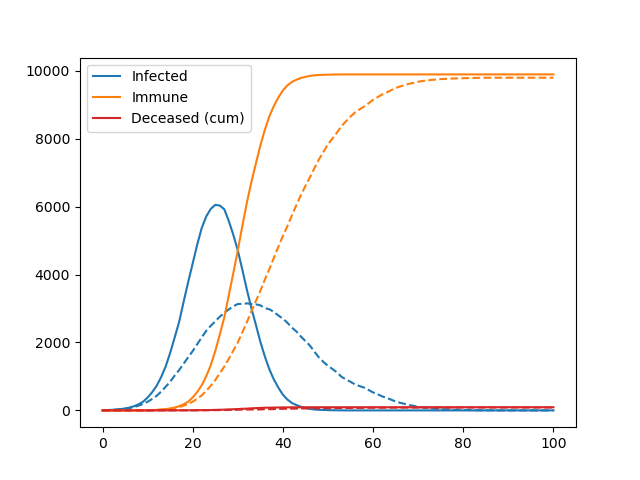
We are simulating a square 2-dimensional (nx x nx pixel) domain which is populated by a maximum number of agents (na), i.e. human individuals. The initial position of the agents on the domain is determined with a pseudo-random number generator. Two or more agents may populate the same pixel.

The simulation runs to a maximum of nt time steps. During every time step each agent may move a maximum number of pixels in the horizontal (x) and vertical (y) direction, as determined by the movemax parameter. If movemax = 2, this means that agents may move between -2 and +2 pixels in the x/y-direction – the actual number of moves within these limits is again determined with the random number generator.

If the random moves would cause an agent to leave the domain, the agent is perfectly “reflected” into the domain, i.e. if a random move would bring an agent to the position nx + 2, the position is corrected to nx – 2.

At the start of the simulation, a number n_initial_infected of randomly selected agents carries the virus.

If two or more agents meet on the same pixel and at least one of them is infected there is a certain probability (probability_of_infection) that non-infected, non-immune agents become infected. This dice roll is repeated for each infected agent at this location.

If infected, agents remain infectious until they recover (time_until_recovery). At the end of the infection period, there is also some probability that agents do not recover, but instead decease (mortality_rate), which reduces the total number of agents on the domain. After recovery, the past infection conveys immunity from another infection.

Potential improvements

There are many. See exercises on the topic.

Getting started

Download the code and run pydemic.py in the terminal or in the ipython interpreter.

TODO Fabien

  • Write tests.
  • Add a visualisation of the spatial domain (with density plots or similar).
Owner
Fabien Maussion
Climate, glaciers, and programming.
Fabien Maussion
Python scripts to manage Chia plots and drive space, providing full reports. Also monitors the number of chia coins you have.

Chia Plot, Drive Manager & Coin Monitor (V0.5 - April 20th, 2021) Multi Server Chia Plot and Drive Management Solution Be sure to ⭐ my repo so you can

338 Nov 25, 2022
nptsne is a numpy compatible python binary package that offers a number of APIs for fast tSNE calculation.

nptsne nptsne is a numpy compatible python binary package that offers a number of APIs for fast tSNE calculation and HSNE modelling. For more detail s

Biomedical Visual Analytics Unit LUMC - TU Delft 29 Jul 05, 2022
Bar Chart of the number of Senators from each party who are up for election in the next three General Elections

Congress-Analysis Bar Chart of the number of Senators from each party who are up for election in the next three General Elections This bar chart shows

11 Oct 26, 2021
Simple, realtime visualization of neural network training performance.

pastalog Simple, realtime visualization server for training neural networks. Use with Lasagne, Keras, Tensorflow, Torch, Theano, and basically everyth

Rewon Child 416 Dec 29, 2022
Python implementation of the Density Line Chart by Moritz & Fisher.

PyDLC - Density Line Charts with Python Python implementation of the Density Line Chart (Moritz & Fisher, 2018) to visualize large collections of time

Charles L. Bérubé 10 Jan 06, 2023
Debugging, monitoring and visualization for Python Machine Learning and Data Science

Welcome to TensorWatch TensorWatch is a debugging and visualization tool designed for data science, deep learning and reinforcement learning from Micr

Microsoft 3.3k Dec 27, 2022
Matplotlib tutorial for beginner

matplotlib is probably the single most used Python package for 2D-graphics. It provides both a very quick way to visualize data from Python and publication-quality figures in many formats. We are goi

Nicolas P. Rougier 2.6k Dec 28, 2022
Extract and visualize information from Gurobi log files

GRBlogtools Extract information from Gurobi log files and generate pandas DataFrames or Excel worksheets for further processing. Also includes a wrapp

Gurobi Optimization 56 Nov 17, 2022
Decision Border Visualizer for Classification Algorithms

dbv Decision Border Visualizer for Classification Algorithms Project description A python package for Machine Learning Engineers who want to visualize

Sven Eschlbeck 1 Nov 01, 2021
Small U-Net for vehicle detection

Small U-Net for vehicle detection Vivek Yadav, PhD Overview In this repository , we will go over using U-net for detecting vehicles in a video stream

Vivek Yadav 91 Nov 03, 2022
Matplotlib JOTA style for making figures

Matplotlib JOTA style for making figures This repo has Matplotlib JOTA style to format plots and figures for publications and presentation.

JOTA JORNALISMO 2 May 05, 2022
Library for exploring and validating machine learning data

TensorFlow Data Validation TensorFlow Data Validation (TFDV) is a library for exploring and validating machine learning data. It is designed to be hig

688 Jan 03, 2023
SummVis is an interactive visualization tool for text summarization.

SummVis is an interactive visualization tool for analyzing abstractive summarization model outputs and datasets.

Robustness Gym 246 Dec 08, 2022
Chem: collection of mostly python code for molecular visualization, QM/MM, FEP, etc

chem: collection of mostly python code for molecular visualization, QM/MM, FEP,

5 Sep 02, 2022
Shaded 😎 quantile plots

shadyquant 😎 This python package allows you to quantile and plot lines where you have multiple samples, typically for visualizing uncertainty. Your d

Mehrad Ansari 13 Sep 29, 2022
a simple REPL display lib for circuitpython

Circuitpython-termio-lib a simple REPL display lib for circuitpython Fonctions cls clear terminal screen and set cursor on top left : coords 0,0 usage

BeBoXoS 1 Nov 17, 2021
Simple CLI python app to show a stocks graph performance. Made with Matplotlib and Tiingo.

stock-graph-python Simple CLI python app to show a stocks graph performance. Made with Matplotlib and Tiingo. Tiingo API Key You will need to add your

Toby 3 May 14, 2022
100 data puzzles for pandas, ranging from short and simple to super tricky (60% complete)

100 pandas puzzles Puzzles notebook Solutions notebook Inspired by 100 Numpy exerises, here are 100* short puzzles for testing your knowledge of panda

Alex Riley 1.9k Jan 08, 2023
Jupyter Notebook extension leveraging pandas DataFrames by integrating DataTables and ChartJS.

Jupyter DataTables Jupyter Notebook extension to leverage pandas DataFrames by integrating DataTables JS. About Data scientists and in fact many devel

Marek Čermák 142 Dec 28, 2022
Complex heatmaps are efficient to visualize associations between different sources of data sets and reveal potential patterns.

Make Complex Heatmaps Complex heatmaps are efficient to visualize associations between different sources of data sets and reveal potential patterns. H

Zuguang Gu 973 Jan 09, 2023