

Perspective is an interactive visualization component for large, real-time datasets. Originally developed for J.P. Morgan's trading business, Perspective makes it simple to build user-configurable analytics entirely in the browser, or in concert with Python and/or JupyterLab. Use it to create reports, dashboards, notebooks and applications, with static data or streaming updates via Apache Arrow.

Features
-
A fast, memory efficient streaming query engine, written in C++ and compiled for both WebAssembly and Python, with read/write/stream/virtual support for Apache Arrow.
-
A framework-agnostic User Interface component and Jupyterlab Widget, over WebWorker (WebAssembly) or WebSocket (Python/Node), and a suite of Datagrid and D3FC Chart plugins. `
Examples
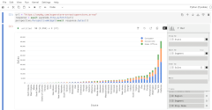
| Superstore | Olympics | Custom Styles |
 |
 |
 |
| Editable | Streaming | CSV |
 |
 |
 |
| IEX Cloud | NYC Citibike | JupyterLab Plugin |
 |
 |
 |

 0 Jul 09, 2022
 10.3k Dec 29, 2022
 1.1k Jan 06, 2023
 54 Oct 04, 2022
 2 Jan 22, 2022
 3k Jan 03, 2023
 4 Aug 02, 2022
 2.7k Jan 06, 2023
 9 Jul 22, 2022
 22 Oct 31, 2022
 3.4k Dec 29, 2022
 91 Dec 29, 2022
 400 Dec 31, 2022
 134 Dec 15, 2022
 10.2k Dec 30, 2022
 1 Jul 06, 2022
 1 Feb 07, 2022
 4 Jan 03, 2022
 3 May 14, 2022