This is a web application to visualize various famous technical indicators and stocks tickers from user

Overview

Visualizing Technical Indicators Using Python and Plotly.

Currently facing issues hosting the application on heroku. As soon as I am able to I'll like the live application here. Until then please check the demo below.

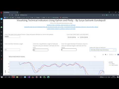
Please refer to the demo video below to understand how it works. (No audio available for the damo)

Demo VIDEO

This is version 1 of the web applicaiton

About the Web app.

With this web applicaiton I aim to provide a free open source method for people to visualize and understand various technical indicators. People can use this applicaiton to select various technical indicators and then visualize and interact with them. This can help new financial engineers get a better understanding of how various parameters of a technical indicator will affect the way we execute trades. It uses the technical analysis library available for python and Plotly's interactive visualization tools to provide the user with a dynamically changing and interactive tool.

Since this is just version 1 of the application I am yet to fix a lot of bugs and improve on it. So do bear with some of the little nuances. In case you would like to send any suggestions please email me at [email protected].

Some features

  1. Interactive visualization
  2. Dynamically changing environment
  3. Users can look up the indicator with the link provided
  4. Any stock across yahoo finance is available

Tutorial on how to use the application.

To use this one must follow the steps below

  1. Open the web applicaiton in your browser
  2. Open Yahoo finance and search for the stock for which you wish to plot the indicator for
  3. Copy the ticker value for the stock from Yahoo FInance
  4. Paste it in the input box of the applicaiton
  5. Select the indicator.
  6. Select the date range and other input parameters based on the indicator
  7. In case you would like to learn more about the indicator click on the link that says "TO learn more about current indicator please click here"

For any suggestions please email me.

Indicators as of Version 1 of the web application.

1. Accumulation/Distribution Index
2. Aroon Indicator
3. Average Directional index
4. Average True Range (ATR)
5. Awesome Oscillator
6. Bollinger Bands (std - 2)
7. Chaikin Money Flow (CMF)
8. Cummilative Return
9. Daily Return
10. Donchian Channel Bands
11. Ease of Movement
12. Exponential Moving Average
13. Ichimoku Kinkō Hyō (Ichimoku)
14. Kaufman’s Adaptive Moving Average', 'value': 'KAMA'},
15. Kelter Channel Index
16. Money Flow index
17. MACD
18. Negative Volume Index Indicator
19. Percentage Price Oscillator
20. Percentage Volume Oscillator
21. Rate of Change
22. Relative Strength Index (RSI)
23. Simple Moving Average
24. Ulcer Index
25. Volume Weighted Average Price
26. Weighted Moving Average

This web application is made for academic purposes only

Owner
I am currently a Senior at SSN College of Engineering My interests lie in Data Analysis and Computational Finance and I wish to pursue a career in the same
Keir&'s Visualizing Data on Life Expectancy

Keir's Visualizing Data on Life Expectancy Below is information on life expectancy in the United States from 1900-2017. You will also find information

9 Jun 06, 2022
A streamlit component for bi-directional communication with bokeh plots.

Streamlit Bokeh Events A streamlit component for bi-directional communication with bokeh plots. Its just a workaround till streamlit team releases sup

Ashish Shukla 123 Dec 25, 2022
A research of IT labor market based especially on hh.ru. Salaries, rate of technologies and etc.

hh_ru_research Проект реализован в учебных целях анализа рынка труда, в особенности по hh.ru Input data В качестве входных данных используются сериали

3 Sep 07, 2022
simple tool to paint axis x and y

simple tool to paint axis x and y

G705 1 Oct 21, 2021
Practical-statistics-for-data-scientists - Code repository for O'Reilly book

Code repository Practical Statistics for Data Scientists: 50+ Essential Concepts Using R and Python by Peter Bruce, Andrew Bruce, and Peter Gedeck Pub

1.7k Jan 04, 2023
Seismic Waveform Inversion Toolbox-1.0

Seismic Waveform Inversion Toolbox (SWIT-1.0)

Haipeng Li 98 Dec 29, 2022
A way of looking at COVID-19 data that I haven't seen before.

Visualizing Omicron: COVID-19 Deaths vs. Cases Click here for other countries. Data is from Our World in Data/Johns Hopkins University. About this pro

1 Jan 10, 2022
Parallel t-SNE implementation with Python and Torch wrappers.

Multicore t-SNE This is a multicore modification of Barnes-Hut t-SNE by L. Van der Maaten with python and Torch CFFI-based wrappers. This code also wo

Dmitry Ulyanov 1.7k Jan 09, 2023
Editor and Presenter for Manim Generated Content.

Editor and Presenter for Manim Generated Content. Take a look at the Working Example. More information can be found on the documentation. These Browse

Manim Community 149 Dec 29, 2022
✅ Today I Learn

Today I Learn EDA numpy_100ex numpy_0~10 airline_satisfaction_prediction BERT_naver_movie_classification NLP_prepare NLP_Tweet_Emotion_Recognition tex

Yeonghoo_Ahn 3 Dec 15, 2022
基于python爬虫爬取COVID-19爆发开始至今全球疫情数据并利用Echarts对数据进行分析与多样化展示。

COVID-19-Epidemic-Map 基于python爬虫爬取COVID-19爆发开始至今全球疫情数据并利用Echarts对数据进行分析与多样化展示。 觉得项目还不错的话欢迎给一个star! 项目的源码可以正常运行,各个库的版本、数据库的建表语句、运行过程中遇到的坑以及解决方式在笔记.md中都

31 Dec 15, 2022
Visualizations for machine learning datasets

Introduction The facets project contains two visualizations for understanding and analyzing machine learning datasets: Facets Overview and Facets Dive

PAIR code 7.1k Jan 07, 2023
Visualise Ansible execution time across playbooks, tasks, and hosts.

ansible-trace Visualise where time is spent in your Ansible playbooks: what tasks, and what hosts, so you can find where to optimise and decrease play

Mark Hansen 81 Dec 15, 2022
LabGraph is a a Python-first framework used to build sophisticated research systems with real-time streaming, graph API, and parallelism.

LabGraph is a a Python-first framework used to build sophisticated research systems with real-time streaming, graph API, and parallelism.

MLH Fellowship 7 Oct 05, 2022
A program that analyzes data from inertia measurement units installed in aircraft and generates g-exceedance curves.

A program that analyzes data from inertia measurement units installed in aircraft and generates g-exceedance curves.

Pooya 1 Dec 02, 2021
Dipto Chakrabarty 7 Sep 06, 2022
Create a visualization for Trump's Tweeted Words Using Python

Data Trump's Tweeted Words This plot illustrates twitter word occurences. We already did the coding I needed for this plot, so I was very inspired to

7 Mar 27, 2022
Monochromatic colorscheme for matplotlib with opinionated sensible default

Monochromatic colorscheme for matplotlib with opinionated sensible default If you need a simple monochromatic colorscheme for your matplotlib figures,

Aria Ghora Prabono 2 May 06, 2022
Some problems of SSLC ( High School ) before outputs and after outputs

Some problems of SSLC ( High School ) before outputs and after outputs 1] A Python program and its output (output1) while running the program is given

Fayas Noushad 3 Dec 01, 2021
Graphical display tools, to help students debug their class implementations in the Carcassonne family of projects

carcassonne_tools Graphical display tools, to help students debug their class implementations in the Carcassonne family of projects NOTE NOTE NOTE The

1 Nov 08, 2021