sci palettes for matplotlib/seaborn
Installation
python3 -m pip install sci-palettes
Usage
import seaborn as sns
import matplotlib.pyplot as plt
import sci_palettes


print(sci_palettes.PALETTES.keys())

sci_palettes.register_cmap()          # register all palettes
sci_palettes.register_cmap('aaas')    # register a special palette

# methods for setting palette
plt.set_cmap('aaas')
plt.style.use('aaas')
sns.set_theme(palette='aaas')
sns.set_palette('aaas')

sns.scatterplot(...)

# set palette when plotting
sns.scatterplot(..., palette='aaas')
Full examples in examples
Gallery
展开查看
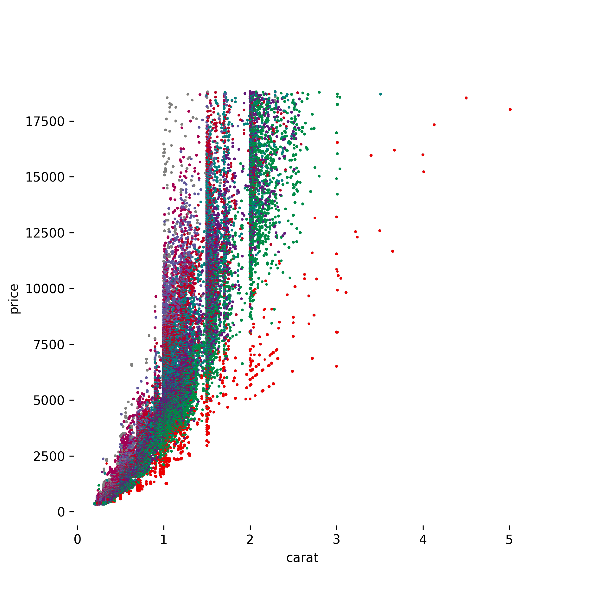
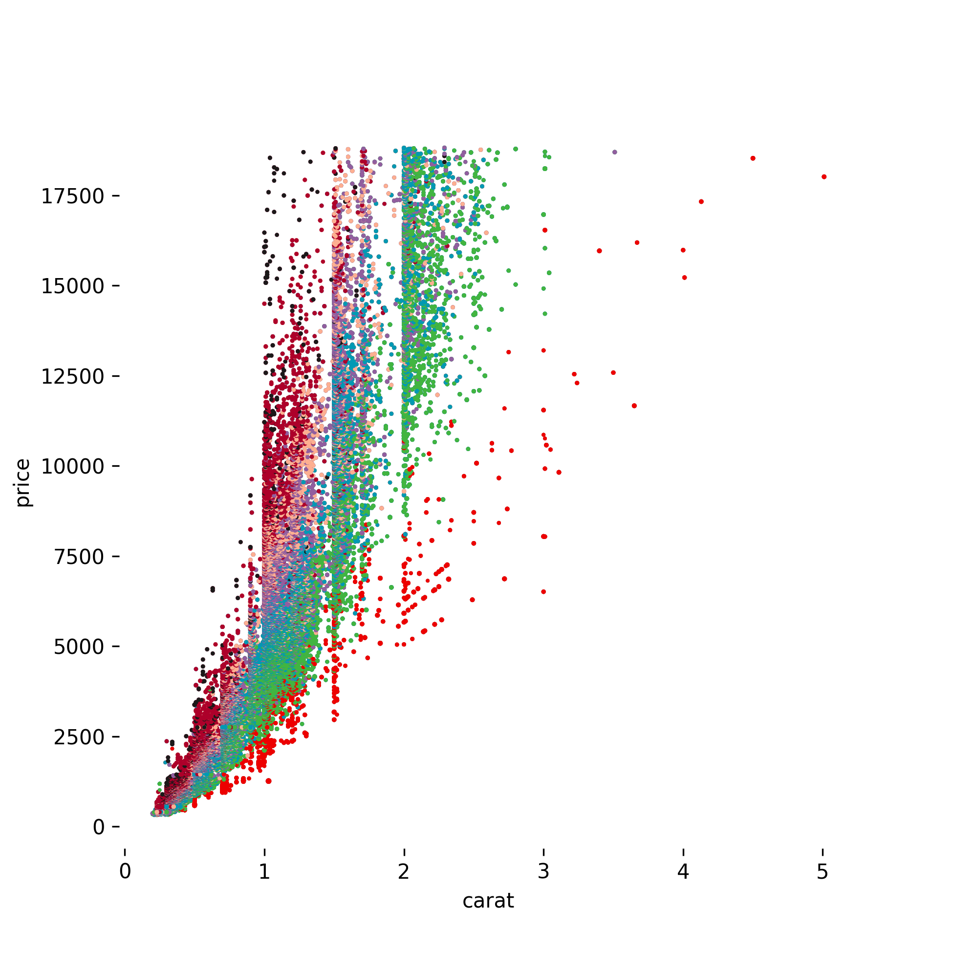
AAAS
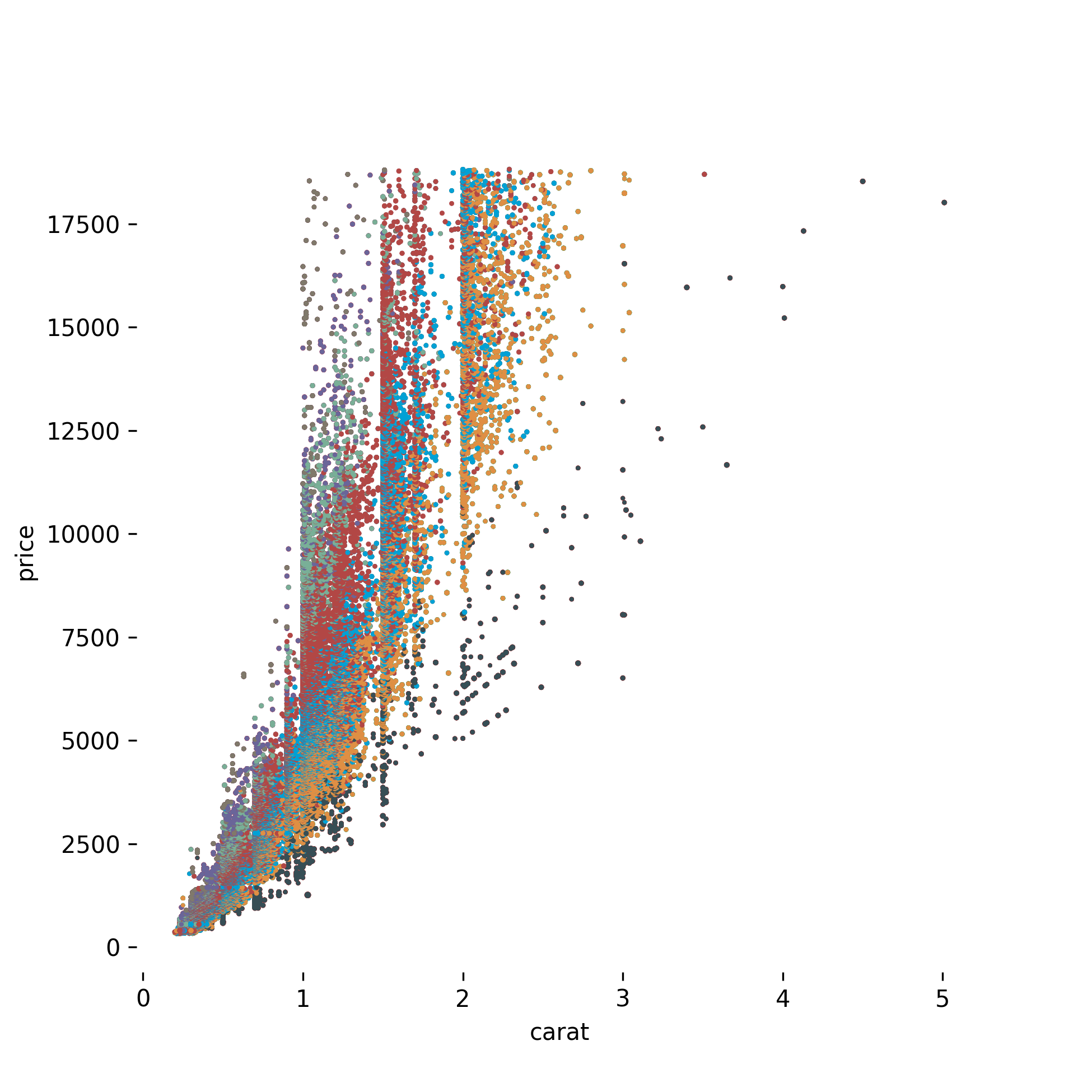
JAMA
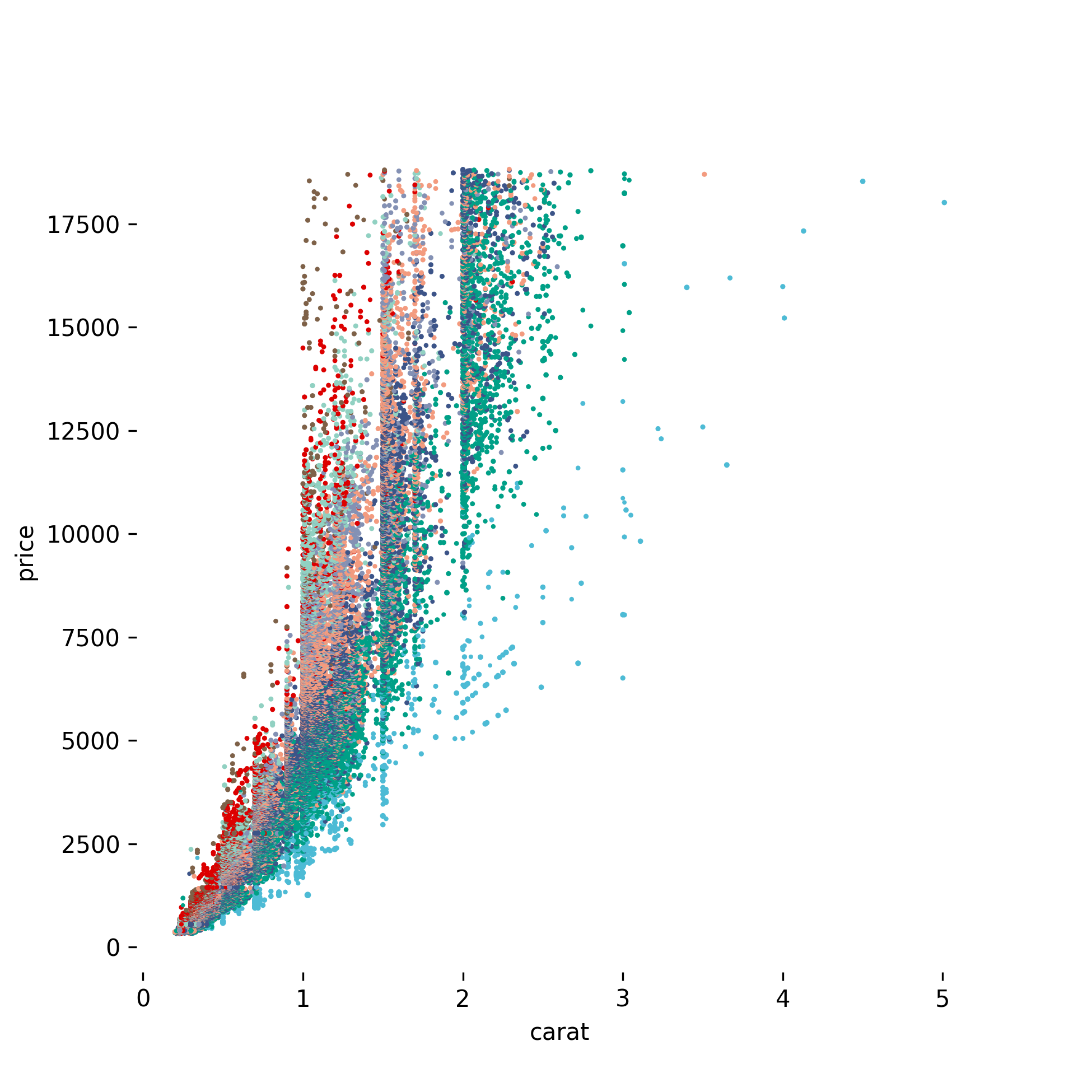
NPG
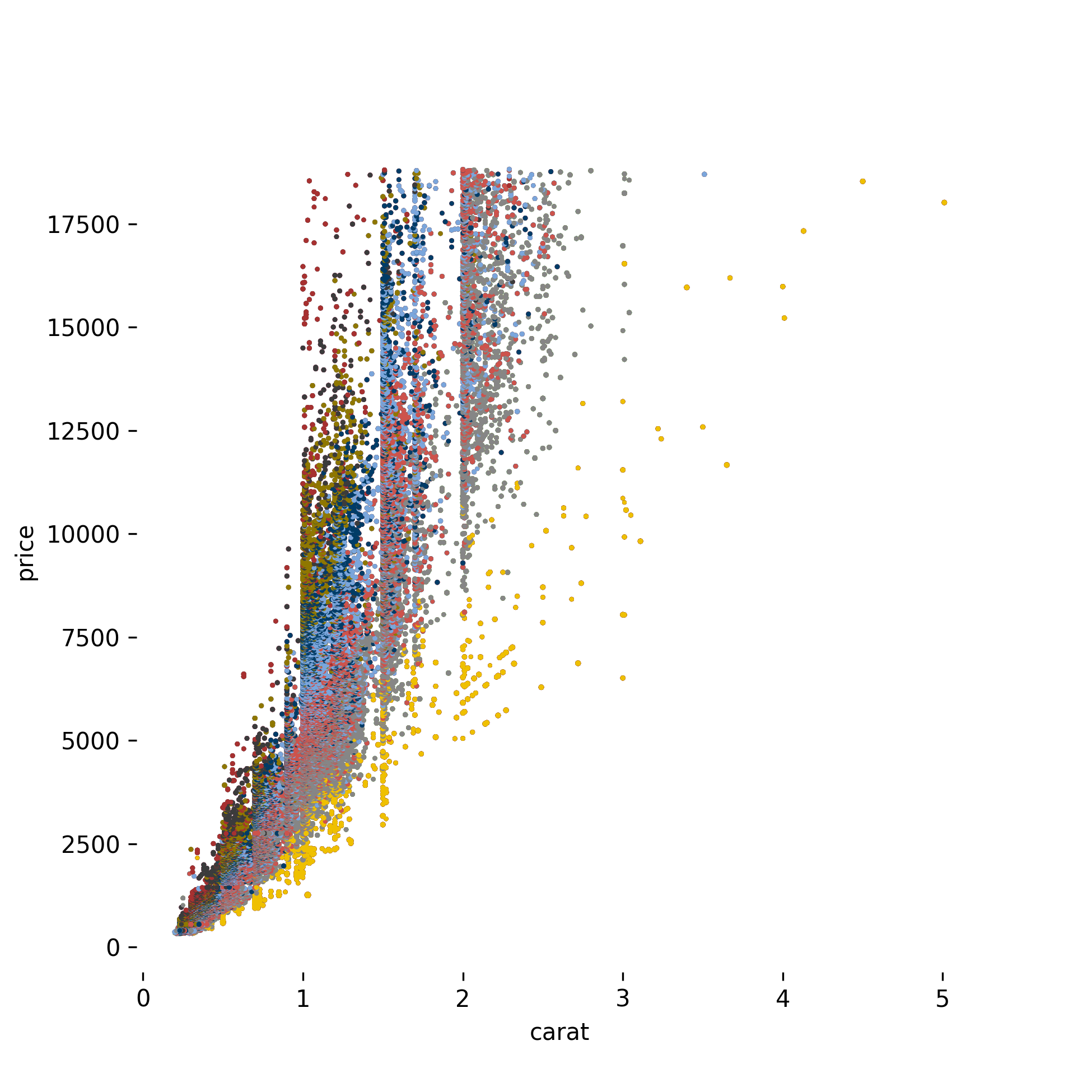
JCO
LANCET

 3 Nov 27, 2022
 3.3k Dec 31, 2022
 1 Nov 19, 2021
 16.7k Jan 08, 2023
 65 Dec 01, 2022
 11 Dec 25, 2022
 1.6k Jan 08, 2023
 21 Nov 20, 2022
 22 Dec 21, 2022
 5 Feb 06, 2022
 7 Sep 02, 2022
 432 Dec 30, 2022
 12.4k Dec 30, 2022
 239 Jan 08, 2023
 13 Dec 15, 2022
 22 Oct 31, 2022
 205 Jan 01, 2023
 209 Dec 21, 2022
 14 Aug 14, 2022