当前位置:网站首页>Mobile web
Mobile web
2022-07-26 06:07:00 【Blue lover】
Move web forerunner
Move web Development background
The good news : There is no need to consider compatibility
Because the emergence of smart phones is much later than computers , So the version of mobile browser is generally very high , therefore H5 and C3 Almost all of the new features support .
There is no IE browser
The bad news : Screen sizes vary
Computer screens vary in size , How to solve ?
Mobile devices have different screen sizes , Can use the layout Center ( Left and right blank ) How to solve it ?
Move web Preview and debug
F12 Developer tools = > Click on the phone icon = > Switch to mobile debugging mode = > Select the mobile device model or adjust the mobile device width
Features of mobile devices
Several noun concepts about screen
Screen size
The diagonal distance of the screen , Generally expressed in inches
for example :iPhone3 and iPhone4 All the screen sizes are 3.5 Inch
Device physical pixels
for example :iPhone3 There are 320 x 480=153600 Physical pixel particles
iPhone4 There are 640 x 960=614400 Physical pixel particles

- Physical resolution ( It is for hardware developers , Is the real resolution )
iPhone3 The physical resolution is 320 x 480
iPhone4 The physical resolution is 640 x 960
Device pixel ratio (dpr)( a key )
PC: The device pixel ratio is 1
Move :

Logical resolution ( a key )( It is for software developers , Is the virtual resolution , Developers only need to know the logical resolution )
iPhone3 and ihpone4 The logical resolution of is :320 x 480
CSS Pixels ( a key )
What is it? ? Is that we are css It's written in English px
stay iphone4 On the cell phone :
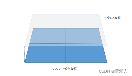
problem : stay css It's written in English 1px Wide and high red box , stay pc End 、iphone3、iphone4、iphoneX How many pixel particles are displayed on ?
pc End : 1 individual iphone3: 1 individual iphone4: 4 individual iphoneX: 9 individual
Multiple screens
Device pixel ratio (dpr) How many times is the screen
Multigraph ( a key )
Double :
Industry UI Design drawings are generally in iphone6/7/8 Of 750*1334 Designed for Standards ( reason : In mobile web On the rise iphone6/7/8 Screen size and physical resolution are the most mainstream ). And converted to css Pixels need to be divided by 2, So we call it a double graph
Multigraph :
Almost all the graphs used in the industry are double graphs , Only a few companies may use triples or even quadruples .
summary :
UI Design draft
It's OK to use several times of drawings in the design , If it is a double image, the measured pixel value should be divided by 2; If it is a triploid image, the measured pixel value should be divided by 3;
picture
The size of the image displayed on the page is not determined by its own size , It is determined by the marked size of the design draft
Try to use a slightly larger picture , In case the picture becomes blurred ; But you can't use too large graphs , Because it will cause slow loading ; So moderate is the best .
viewport ( a key )
What is a viewport ?
It is the rectangular area of the web page displayed by the browser , use CSS In other words “ How much space is available ”, It's basically equivalent to " window "
What is the default viewport and the source of the default viewport ?
demonstration : first generation iPhone Release conference / complete + Chinese captions _ Bili, Bili _bilibili( from 67 Minutes to watch )
What is an ideal viewport ?
Is the size of the screen of the phone itself
How to set the viewport of the browser as the ideal viewport ? The code is as follows :
<meta name = "viewport" content="width=device-width, initial-scale=1, maximum-scale=1.0, minimum-scale=1.0, user-scalable=no">

<!--
     explain :
		meta: Provide meta information about the page (meta-information)
		viewport: viewport
    width = device-width :  Set the browser viewport width to the device width ( Ideal viewport )
    initial-scale=1 :  Set the initial scaling
    maximum-scale = 1.0 : The maximum scale that allows the user to zoom
    minimum-scale = 1.0 : The minimum scale that allows the user to zoom
    user-scalable = no/0 : Whether to allow users to zoom the page
-->
<!--
     Add : Generally, zoom should be disabled , The goal is to make web Apps look more like mobile apps , And it can also avoid some problems caused by scaling bug
		vscode Set up :/Resources/app/extensions/emmet/node_modules/vscode-emmet-helper/lib/cjs/expand/expand-full.js
-->
Fluid layout
Percentage units
px: Absolute units As many pixels as you write
% : Percentage units width and height Are based on the percentage of block level elements that contain it , Like the parent element div Width is 100px, Set child elements width: 50%, Then the width of the child element is 50px
application ( a key )

Project practice
Preparation before actual combat
Style initialization
    * {
      box-sizing: border-box;
    }
    body {
      font-size: 12px;
    }
    /*  Clear the inner and outer margins of all our labels  */
    html,body,ul,li,ol,dl,dd,dt,p,h1,h2,h3,h4,h5,h6,form,fieldset,legend,img {
      margin: 0;
      padding: 0;
    }
    /* em  and  i  Italicized text does not tilt  */
    em,
    i {
        font-style: normal
    }
    /*  Get rid of li  The little dots of  */
    li {
        list-style: none
    }

    img {
        /* border 0  Take care of low version browsers   If   There will be a border problem if there are links outside the picture  */
        border: 0;
        /*  Cancel the problem of blank gap at the bottom of the picture  */
        vertical-align: middle
    }

    a {
        text-decoration: none
    }

    input, button {
      /*  Remove border  */
      border: 0;
      /*  Contour line  */
      outline: none;
    }
    .clearfix::after{
      content: '';
      display: block;
      clear: both;
      visibility: hidden;
      height: 0;
    }
Mainstream programs :normalize.css
Official website :Normalize.css: Make browsers render all elements more consistently.
Box model
/* Standard box model */
box-sizing: content-box;
/*C3 The box model */
box-sizing: border-box;
Layout ideas
From big to small From the outside in
matters needing attention
UI The picture is based on Iphone6/7/8 Designed for Standards , Its width is 750px, When we write css Pixels need to be divided by 2
Is the actual completion effect consistent with UI Keep the diagram consistent ( Restore 95% above )
because UI The picture is based on Iphone6/7/8 Designed for Standards , So we should give priority to adaptation Iphone6/7/8,iphone6/7/8 Under the condition that this is no problem , Then adapt to other equipment
The holy grail layout ( a key )
Realize the code of double wings :

<style>
* {
box-sizing: border-box;
}
body {
font-size: 12px;
}
/* Clear the inner and outer margins of all our labels */
html,body,ul,li,ol,dl,dd,dt,p,h1,h2,h3,h4,h5,h6,form,fieldset,legend,img {
margin: 0;
padding: 0;
}
/* em and i Italicized text does not tilt */
em,
i {
font-style: normal
}
/* Get rid of li The little dots of */
li {
list-style: none
}
img {
/* border 0 Take care of low version browsers If There will be a border problem if there are links outside the picture */
border: 0;
/* Cancel the problem of blank gap at the bottom of the picture */
vertical-align: middle
}
a {
text-decoration: none
}
input, button {
/* Remove border */
border: 0;
/* Contour line */
outline: none;
}
.clearfix::after{
content: '';
display: block;
clear: both;
visibility: hidden;
height: 0;
}
header {
width: 100%;
height: 100px;
}
.left {
position: absolute;
top: 0;
left: 0;
width: 100px;
height: 100px;
background-color: red;
}
.right {
position: absolute;
top: 0;
right: 0;
width: 100px;
height: 100px;
background-color: red;
}
</style>
</head>
<body>
<header>
<div class="left"></div>
<div class="middle"></div>
<div class="right"></div>
</header>
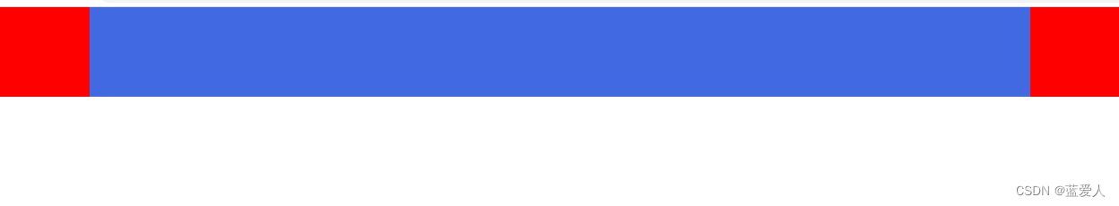
</body>There are two ways to realize that the middle box can empty the double wings on both sides :
Understand knowledge :
Add about to a box padding or margin There are two ways not to break the parent box ( a key )
padding or margin + Not set up width
principle : By default, block level elements always occupy the entire parent box in width , Even if you add about padding or margin, Nor will it break the parent box .
padding + C3 The box model
Once a box is set width, Only in this way
Mode one : width + padding+c3 The box model
    /*  Scheme 1  */
    .middle {
      width: 100%;
      height: 100px;
      padding: 0 100px;
      box-sizing: border-box;
      background-color: royalblue;
    }
Option two : about padding or margin Empty the left and right sides
    /*  Option two  */
    .middle {
      height: 100px;
      /* margin: 0 100px; */
      padding: 0 100px;  /* padding It takes up the background color of the box  */
      background-color: royalblue;
}边栏推荐
- 金仓数据库 KingbaseES SQL 语言参考手册 (10. 查询和子查询)
- VS中使用动态库
- Realize channel routing based on policy mode
- Niuke network: TOPK problem of additive sum between two ordinal groups
- Taobao pinduoduo Tiktok 1688 Suning taote jd.com and other keyword search commodity API interfaces (keyword search commodity API interface, keyword search commodity list interface, classification ID s
- Detailed explanation of the whole process of coding's pressure measurement operation
- 递归处理——子问题
- Full binary tree / true binary tree / complete binary tree~
- 字节面试题——判断一棵树是否为平衡二叉树
- Establishment of log collection and analysis platform-1-environment preparation
猜你喜欢

满二叉树 / 真二叉树 / 完全二叉树 ~

逆序打印链表
Solve vagrant's error b:48:in `join ': incompatible character encodings: GBK and UTF-8 (encoding:: Compatib

vagrant下载速度慢的解决方法

分布式 | 实战:将业务从 MyCAT 平滑迁移到 dble

"Recursive processing of subproblems" -- judging whether two trees are the same tree -- and the subtree of another tree

Convolutional neural network (IV) - special applications: face recognition and neural style transformation

基于消防GIS系统的智慧消防应用

某公司给每个工位装监控:只为看员工写代码?
Excitation method and excitation voltage of hand-held vibrating wire vh501tc acquisition instrument
随机推荐
Database SQL language practice
A company installs monitoring for each station: write code only to see employees?
Docking wechat payment (II) unified order API
How to view the container name in pod
Mysql45 speak in simple terms index
Viewing the technology stack of distributed system from the crash report of station B
[free and easy to use] holiday query interface
Kingbasees SQL language reference manual of Jincang database (6. Expression)
Benji Banas launched the second season of earn while playing bonus activities, supporting the use of multiple Benji passes!
Optical quantum milestone: 3854 variable problems solved in 6 minutes
Ganglia安装部署流程
Mysql45 talking about global lock, table lock and row lock
[(SV & UVM) knowledge points encountered in written interview] ~ phase mechanism
Matlab 向量与矩阵
Introduction of four redis cluster schemes + comparison of advantages and disadvantages
[2023 Jerry technology approval test questions in advance] ~ questions and reference answers
How can programmers improve mental internal friction?
分布式 | 实战:将业务从 MyCAT 平滑迁移到 dble
Jdbc流式查询与游标查询
What is spark serialization for?