当前位置:网站首页>grid布局
grid布局
2022-07-16 02:48:00 【菜蜗牛很菜】
文章目录
网格及fr单位

code
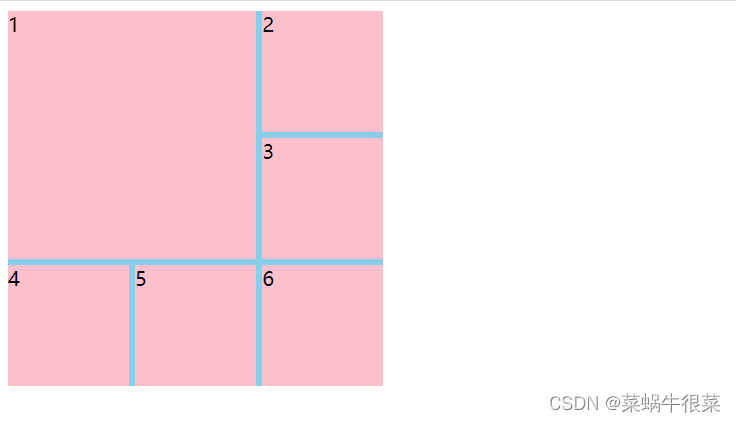
 <style> .main{
       width: 300px; height: 300px; background: skyblue; display: grid; grid-template-columns: 1fr 1fr 1fr; grid-template-rows: 2fr 1fr; } .main div{
       background: pink; } </style>
<div class="main">
    <div>1</div>
    <div>2</div>
    <div>3</div>
    <div>4</div>
    <div>5</div>
    <div>6</div>

</div>
result
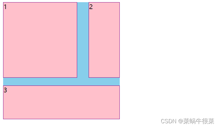
合并网格及网格命名

code
  <style> .main{
       width: 300px; height: 300px; background: skyblue; display: grid; grid-template-columns: 1fr 1fr 1fr; grid-template-rows: 1fr 1fr 1fr; grid-template-areas: "a1 a1 a2" "a1 a1 a2" "a3 a3 a3" ; } .main div{
       background: pink; border: 1px purple solid; box-sizing: border-box; } .main div:nth-of-type(1){
       grid-area: a1; } .main div:nth-of-type(2){
       grid-area: a2; } .main div:nth-of-type(3){
       grid-area: a3; } </style>


<div class="main">
    <div>1</div>
    <div>2</div>
    <div>3</div>
</div>
result


网格间隙

       /*row-gap: 20px;*/
            /*column-gap: 30px;*/
            grid-gap: 20px 30px;
 <style> .main{
       width: 300px; height: 300px; background: skyblue; display: grid; grid-template-columns: 1fr 1fr 1fr; grid-template-rows: 1fr 1fr 1fr; grid-template-areas: "a1 a1 a2" "a1 a1 a2" "a3 a3 a3"; /*row-gap: 20px;*/ /*column-gap: 30px;*/ grid-gap: 20px 30px; } .main div{
       background: pink; border: 1px purple solid; box-sizing: border-box; } .main div:nth-of-type(1){
       grid-area: a1; } .main div:nth-of-type(2){
       grid-area: a2; } .main div:nth-of-type(3){
       grid-area: a3; } </style>
<div class="main">
    <div>1</div>
    <div>2</div>
    <div>3</div>
</div>
网格对齐方式
子项对齐

   <style> .main {
       width: 300px; height: 300px; background: skyblue; display: grid; grid-template-rows: 1fr 1fr 1fr; grid-template-columns: 1fr 1fr 1fr; justify-items: center; align-items: center; } .main div{
       width: 50px; height: 50px; background: pink; } </style>

<div class="main">
    <div>1</div>
    <div>2</div>
    <div>3</div>
    <div>4</div>
    <div>5</div>
    <div>6</div>
    <div>7</div>
    <div>8</div>
    <div>9</div>
</div>
result
 justify-items: start;
 align-items: end;

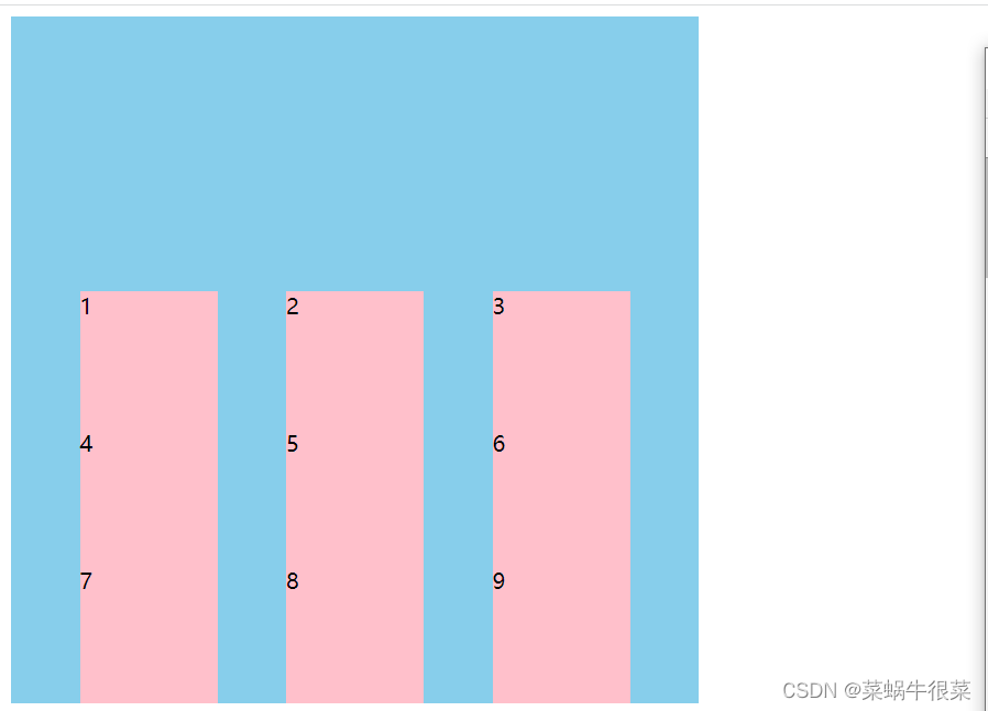
复合样式
所有网格对齐

  <style> .main {
       width: 500px; height: 500px; background: skyblue; display: grid; grid-template-rows: 100px 100px 100px; grid-template-columns: 100px 100px 100px; justify-content: space-evenly; align-content: end; } .main div{
       background: pink; } </style>
    <div class="main">
    <div>1</div>
    <div>2</div>
    <div>3</div>
    <div>4</div>
    <div>5</div>
    <div>6</div>
    <div>7</div>
    <div>8</div>
    <div>9</div>
</div>
缩写

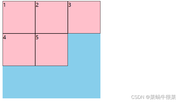
隐式显式网格

默认行隐式网格
   <style> .main {
       width: 300px; height: 300px; background: skyblue; display: grid; grid-template-columns: 1fr 1fr 1fr; grid-template-rows: 100px; } .main div{
       border: 1px black solid; box-sizing: border-box; background: pink; } </style>
    <div class="main">
    <div>1</div>
    <div>2</div>
    <div>3</div>
    <div>4</div>
    <div>5</div>

</div>
设置了一行三列,4和5自动分布在了隐式网格

调节隐式网格
       .main {

            width: 300px;
            height: 300px;
            background: skyblue;
            display: grid;
            grid-template-columns: 1fr 1fr 1fr;
            grid-template-rows: 100px;
            /*默认row就是行产生隐式网格*/
            grid-auto-flow: row;
            /*可以调节产生隐式网格的高度*/
            grid-auto-rows: 100px;

        }
 <style> .main {
       width: 300px; height: 300px; background: skyblue; display: grid; grid-template-columns: 100px; grid-template-rows: 1fr 1fr 1fr; grid-auto-flow: column; grid-auto-columns: 100px; } .main div{
       border: 1px black solid; box-sizing: border-box; background: pink; } </style>
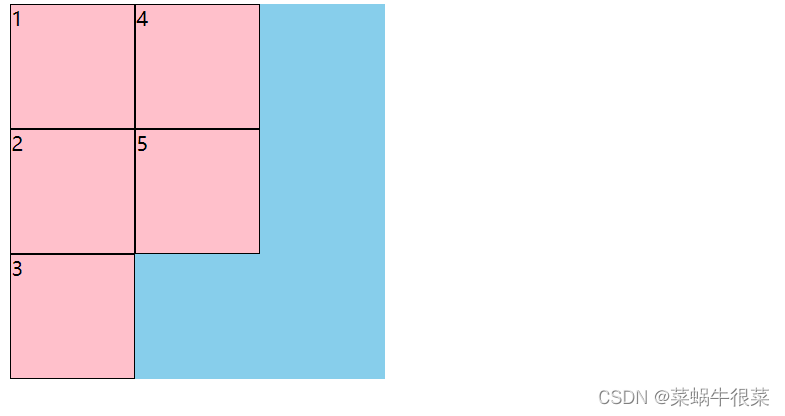
规定从哪里开始排
<style> .main {
       width: 300px; height: 300px; background: skyblue; display: grid; grid-template-columns: 1fr 1fr 1fr; grid-template-rows: 100px; /*默认row就是行产生隐式网格*/ grid-auto-flow: row; /*可以调节产生隐式网格的高度*/ grid-auto-rows: 100px; } .main div{
       border: 1px black solid; box-sizing: border-box; background: pink; } .main div:nth-of-type(1){
       grid-column-start: 2; } </style>

<div class="main">
    <div>1</div>
    <div>2</div>
    <div>3</div>
    <div>4</div>
    <div>5</div>

</div>

紧密排列dense
紧密排列dense
grid-auto-flow: row dense;

基于线的元素位置

<style> .main {
       width: 300px; height: 300px; background: skyblue; display: grid; grid-template-columns: 1fr 1fr 1fr; grid-template-rows: 1fr 1fr 1fr; } .main div{
       background: pink; grid-column-start: 2; grid-column-end: 3; grid-row-start: 2; grid-row-end: 4; } </style>
    <div class="main">
    <div>1</div>


</div>

其他写法


repeat minmax
根据分辨率不同调节行列

叠加布局

 <style> .main {
       width: 750px; height: 500px; background: skyblue; display: grid; } .main img{
       grid-area: 1/1/1/1; } .main span{
       grid-area: 1/1/1/1; justify-self: end; margin: 5px; } .main p{
       grid-area: 1/1/1/1; align-self: end; margin: 0; padding: 0; background:rgba(0,0,0,0.5); height: 30px; line-height: 30px; color: white; } </style>

<div class="main">
    <img src="https://gimg2.baidu.com/image_search/src=http%3A%2F%2Fpic5.40017.cn%2F01%2F000%2F4a%2F1d%2FrBLkBltAHdGAN4BLAADjeBFk6iU686_750x_00.jpg&refer=http%3A%2F%2Fpic5.40017.cn&app=2002&size=f9999,10000&q=a80&n=0&g=0n&fmt=auto?sec=1660151456&t=859a309ea075a34710ffd37a890d6850" alt="">
    <span>自制</span>
    <p>热卖中...</p>


</div>

多种组合排列

<style> .main {
       width: 300px; height: 300px; background: skyblue; display: grid; grid-template-columns: repeat(3,1fr); grid-template-rows: repeat(3,1fr); grid-gap: 5px; } .main div{
       background: pink; } .main div:nth-of-type(1){
       grid-area: 1/1/span 2/span 2; } </style>
<div class="main">
    <div>1</div>
    <div>2</div>
    <div>3</div>
    <div>4</div>
    <div>5</div>
    <div>6</div>


</div>
栅格布局

<style> .row {
       background: skyblue; display: grid; grid-template-columns: repeat(12, 1fr); grid-template-rows: 50px; grid-auto-rows: 50px; } .row div {
       background: pink; border: 1px black solid; } .row .col-1 {
       grid-area: auto/ auto/ auto/span 1; } .row .col-2 {
       grid-area: auto/ auto/ auto/span 2; } .row .col-3 {
       grid-area: auto/ auto/ auto /span 3; } .row .col-4 {
       grid-area: auto/ auto/ auto /span 4; } .row .col-5{
       grid-area: auto/ auto/ auto /span 5; } .row .col-6{
       grid-area: auto/ auto/ auto /span 6; } .row .col-7 {
       grid-area: auto/ auto/ auto /span 7; } .row .col-8{
       grid-area: auto/ auto/ auto /span 8; } .row .col-9{
       grid-area: auto/ auto/ auto /span 9; } .row .col-10{
       grid-area: auto/ auto/ auto /span 10; } .row .col-11{
       grid-area: auto/ auto/ auto /span 11; } .row .col-12{
       grid-area: auto/ auto/ auto /span 12; } </style>
 <div class="row">
    <div class="col-3">1</div>
</div>

行列自适应布局

    <style> .main{
       width: 300px; background: skyblue; display: grid; grid-template-columns: repeat(3,1fr); grid-auto-rows: 100px; grid-gap: 5px; } .main div{
       background: pink; } </style>

<div class="main">
    <div>1</div>
    <div>2</div>
    <div>3</div>
    <div>4</div>
    <div>5</div>
    <div>6</div>
    <div>6</div>
    <div>6</div>
    <div>6</div>
    <div>6</div>
    <div>6</div>
    <div>6</div>
    <div>6</div>
</div>

    <style> .main{
       height: 300px; background: skyblue; display: inline-grid; grid-template-rows: repeat(3,1fr); grid-auto-flow: column; grid-auto-columns: 100px; grid-gap: 5px; } .main div{
       background: pink; } </style>

<div class="main">
    <div>1</div>
    <div>2</div>
    <div>3</div>
    <div>4</div>
    <div>5</div>
    <div>6</div>
    <div>6</div>
    <div>6</div>
    <div>6</div>
    <div>6</div>
    <div>6</div>
    <div>6</div>
    <div>6</div>
</div>

边栏推荐
- How to make encrypted PDF files editable
- 沉睡者的简历-有老板需要招兵买马吗?您的成功就差一个我
- 【后疫情时代的慢直播:镜头之下的美好时光】
- 【全文7000字】顺丰同城测试开发一面 49min答案
- Recommend the most popular flow chart and chart tool draw IO, old tools are no longer used
- Single target tracking [correlation filtering] atom:accurate tracking by overlap maximization
- How does an enterprise choose the right time series database?
- CRS-2674,CRS-4000
- 大二学科不挂科 速冲方法推荐(数据结构+计组+操作系统+算法+数据库+计网)
- zip/enumerate/map函数的使用
猜你喜欢

编程老司机带你玩转 CompletableFuture 异步编程

Redis installation (Windows) and common usage methods

软件测试—学习笔记3

深度解读财团参与Twitter私有化的投资逻辑
网络安全--Kali使用mdk3攻击wifi(详细教程)
广电5G正式进场:没有四国混战,而是两线对抗

ORA-00322&ORA-00312

开源数据集——花分类数据集

022. Detailed explanation of static and final keywords

From application to bottom: 36 pictures take you into redis world (Part 1)
随机推荐
2022.07.12 group a summary
Coming home late
Is free knowledge not worth paying attention to?
Targeting R+ (version 30 and above) requires the resources. arsc of installed APKs to be stored uncom
自动追番工具BGmi
数字藏品系统开发,助力企业元宇宙场景营销
Gm3379 [noi2013 simulation] query
做MySQL题的随笔(关键字记录)
Linux -- connecting to MySQL database and basic operations
Usage and difference between link reference and @import reference
6000件数字藏品上线秒空!“国宝级”数字藏品长这样
TCP IP ICMP Ethernet frame format
深度解读财团参与Twitter私有化的投资逻辑
Network security -- Kali uses mdk3 to attack WiFi (detailed tutorial)
Nc20566 [scoi2010] games
Unity screenshot function and let the UI display
Analysis of Large Integer Decomposition
Typescript之常量与对象冻结
Airiot low code development platform, 10 minutes to build the Internet of things system
PX4模塊設計之九:PX4飛行模式簡介