当前位置:网站首页>Open source WPF control library adonisui
Open source WPF control library adonisui
2022-07-19 15:56:00 【Dotnet cross platform】
original text :https://github.com/benruehl/adonis-ui
translate : The wolf at the end of the desert ( Google translation blessing )
be used for WPF Application lightweight UI tool kit , Provide classic and enhanced Windows Visual effect :
Warehouse information
Warehouse address :https://github.com/benruehl/adonis-ui
Demo:https://github.com/benruehl/adonis-ui#demo

What are they ?
Almost all WPF Control's default style and template
Other styles can be used as needed for convenience
Two color schemes ( Light and dark ) It can also be used to customize styles
Support changing color scheme at run time
Support other custom color schemes
Extension of built-in control , Provide watermark and other functions
There are few custom controls for common use cases
Design principles
Keep close to WPF Original appearance of
No configuration required , But provide options for people who want to control global and personal behavior
Support WPF Extensions to built-in controls that create new controls , In order to become a direct substitute for existing applications
file
Use document address :https://benruehl.github.io/adonis-ui/docs/getting-started/introduction/
Let's get started
Reference... In your project
AdonisUIandAdonisUI.ClassicTheme. It can be done by NuGet[1] Or download it manually [2] get . At present, it needs at least.NET Framework 4.5or.NET Core 3.0.
Install-Package AdonisUI.ClassicTheme -Version 1.17.1Add resources to your application like this
App.xamlin :
<Application xmlns:adonisUi="clr-namespace:AdonisUI;assembly=AdonisUI">
    <Application.Resources>
        <ResourceDictionary>
            <ResourceDictionary.MergedDictionaries>
                <ResourceDictionary Source="pack://application:,,,/AdonisUI;component/ColorSchemes/Light.xaml"/>
                <ResourceDictionary Source="pack://application:,,,/AdonisUI.ClassicTheme;component/Resources.xaml"/>
            </ResourceDictionary.MergedDictionaries>
        </ResourceDictionary>
    </Application.Resources>
</Application>
from Adonis UI The default style of derives the window style , As shown below :
<Window.Style>
    <Style TargetType="Window" BasedOn="{StaticResource {x:Type Window}}"/>
</Window.Style>
Control features
Switch color schemes at runtime
Adonis UI With light and dark color schemes . You can add custom color schemes without restrictions .
| Light scheme | Dark scheme Scheme |
|---|---|
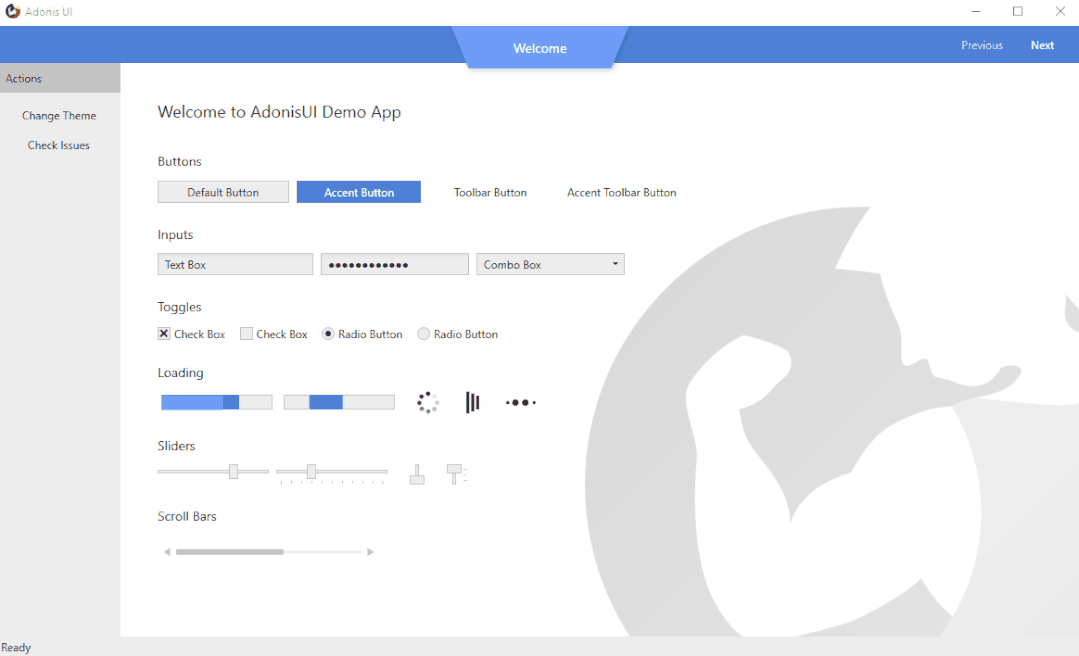 | 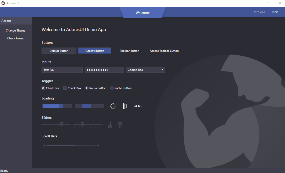 |
To switch color schemes at runtime ,ResourceDictionary You need to delete all colors and brushes containing the scheme from the application resources , So that you can add different color schemes . This can be done using the built-in ResourceLocator Class to complete , For example, in the click event handler .
AdonisUI.ResourceLocator.SetColorScheme(Application.Current.Resources, ResourceLocator.DarkColorScheme); The first parameter must be right ResourceDictionary Contains references to color schemes , As its MergedDictionaries. The second parameter is the color scheme that should be added Uri.
Read more about switching color schemes [3]
Emphasis color
While relying on the uniform color of the background area and border , Accent colors can be used to visually highlight important points . By default , Both color schemes use blue as the accent color . This can be changed by overriding the emphasis color value . A set of styles helps to display controls such as buttons on accent colors .
Read more about colors and brushes [4]
Custom window title bar
Adonis UI Brings a custom window title bar , By default, it looks like Windows 10 The title bar is exactly the same , But there are several advantages . First , It respects the current color scheme , So when you switch to a dark color scheme, it will darken . secondly , Its color can also be set independently of the color scheme , For example, through bindings and triggers . Third , Its content can be easily customized , For example, by hiding icons 、 Add additional buttons or place labels in them . Derive your window AdonisWindow To receive these functions .
 |  |
 |  |
Read more about forms [5]
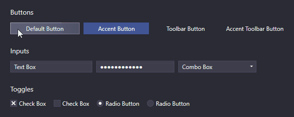
Cursor spotlight hover effect (Cursor Spotlight hover effect)
Dependent on interaction UI Control ( Button like 、 The text box 、 Combo box 、 List box, etc ) Used here is called Cursor Spotlight Hover effect . When hovering over a hidden control , It makes the layer around the cursor visible . It applies to two color schemes .
| Light scheme | Dark scheme Scheme |
|---|---|
 |  |
Because it is related to OpacityMasks Working together is not limited to illuminating UI Control . It can be used to hide almost everything that can be used WPF Render things .
Read more about cursor spotlight effects [6]
chain reaction (Ripple effect)
By default , Button and ContextMenuItem The ripple effect appears when you click .ListBoxItems And support it , But it is disabled by default .
| Light scheme | Dark scheme Scheme |
|---|---|
 |  |
Read more about the ripple effect [7]
Layers
stay UI In design , It is common for containers to group items that belong together . for example , stay WPF in , This can be used GroupBoxes Make it easy . If the container is assigned different background colors to better distinguish the grouped items and their surroundings , Then color contrast may become a problem . Gray buttons may initially look good on a white application background , But when they are moved to a place that also has a gray background GroupBox In the middle of the day , They may lose visibility .
That's why Adonis UI A simple hierarchical system is introduced , It can be based on UI The layer to which the control belongs is automatically adjusted UI The color of the control . By default , All styles Adonis UI Will automatically adapt to the system , But you can also disable it .
| Light scheme | Dark scheme Scheme |
|---|---|
 |  |
These images show a picture by Buttons and GroupBoxes A simple layout . All controls use their default styles , There are no properties set except their contents . The layered system is responsible for slightly adjusting the color and color of the buttons on each layer GroupBoxes The background of . It ensures that there is always a difference between the background of the container and the background of the controls in the container . If there is no system , All buttons will have exactly the same background color .
The system is fully customizable . Of course , It applies to all controls , Not just buttons . Each control can be configured to add layers to its children , But by default, it is already for some controls ( Such as GroupBoxes) Enable it . Controls can also be forced to reside on a specific layer .
Read more about tiered systems [8]
Data validation support
WPF The data validation mechanism of provides the ability to validate attribute values and allocate error messages when they are invalid . stay Adonis UI in , If the control is bound to an invalid property , The error is indicated by a red border and an error icon in the control template . When the control gets keyboard focus or the user hovers over the icon , The error message will be displayed as a pop-up window . To set validation errors , You can use interfaces IDataErrorInfo or WPF.
| Light scheme | Dark scheme Scheme |
|---|---|
 | 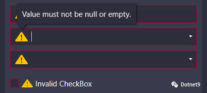 |
By default , The error message pop-up window is displayed on the keyboard focus and mouse over . Both can be disabled separately .
Read more about data validation [9]
ComponentResourceKeys
Adonis UI The resources provided have allocated ComponentResourceKey, In order to use them in a simple way . Resources exist in color 、 paint brush 、 Size 、 style 、 Templates and icons . for example , The foreground brush of the current color scheme can be used by referencing its resource key , Such as Foreground="{DynamicResource {x:Static adonisUi:Brushes.ForegroundBrush}}".ComponentResourceKeys Allow to use IntelliSense Done automatically , This will come in handy when exploring available resources .
Read more about resources [10]
Space
Between controls Space Usually by margin 、 Fill and grid row and column controls . In order to ensure the Space Agreement , You can choose a fixed size , Use anywhere ( Or its multiple ).Adonis UI Provides a system to support you to do so . By default , The base value of space is 8, But it can be adjusted for horizontal and vertical space respectively .
You can use space like this :
<RowDefinition Height="{adonisUi:Space 1}"/> <!-- equals Height="8" -->
<RowDefinition Height="{adonisUi:Space 2.5}"/> <!-- equals Height="20" -->
<RowDefinition Height="{adonisUi:Space 2.5+1}"/> <!-- equals Height="21" -->
<RowDefinition Height="{adonisUi:Space 2.5-1}"/> <!-- equals Height="19" -->
It is also applicable to the thickness of margin and filling :
<Button Margin="{adonisUi:Space 1}"/> <!-- equals Margin="8,8,8,8" -->
<Button Margin="{adonisUi:Space 1, 2}"/> <!-- equals Margin="8,16,8,16" -->
<Button Margin="{adonisUi:Space 1, 1+2, 2, 3}"/> <!-- equals Margin="8,10,16,24" -->
Read more about space [11]
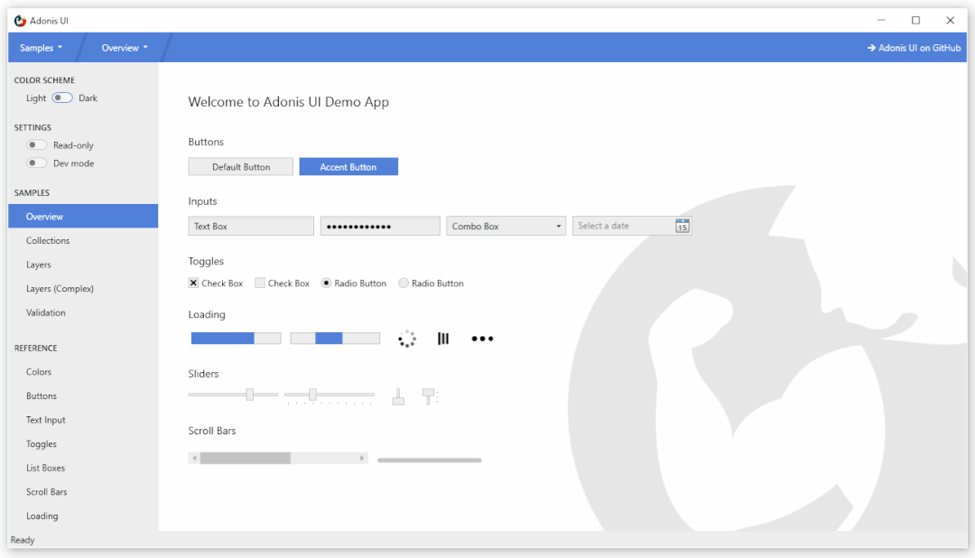
demonstration
There's one on the board WPF Demo application , It shows Adonis UI Most of the functions . Please don't hesitate , Have a try .
Download... Here [12]
License
MIT Benjamin Rühl
Reference resources
AdonisUI - be used for WPF Application lightweight UI tool kit , Provide classic but enhanced Windows Visual effect [13]
Reference material
[1]
NuGet: https://www.nuget.org/packages/AdonisUI.ClassicTheme/
[2]Manual Download : https://github.com/benruehl/adonis-ui/releases
[3]Read more about switching color schemes : https://benruehl.github.io/adonis-ui/docs/guides/colors-and-brushes/#switching-color-schemes-at-runtime
[4]Read more about colors and brushes : https://benruehl.github.io/adonis-ui/docs/guides/colors-and-brushes/
[5]Read more about forms : https://benruehl.github.io/adonis-ui/docs/guides/window/
[6]Read more about cursor spotlight effects : https://benruehl.github.io/adonis-ui/docs/guides/cursor-spotlight/
[7]Read more about the ripple effect : https://benruehl.github.io/adonis-ui/docs/guides/ripple/
[8]Read more about tiered systems : https://benruehl.github.io/adonis-ui/docs/guides/layers/
[9]Read more about data validation : https://benruehl.github.io/adonis-ui/docs/guides/data-validation/
[10]Read more about resources : https://benruehl.github.io/adonis-ui/docs/guides/styles-and-templates/
[11]Read more about space : https://benruehl.github.io/adonis-ui/docs/guides/space/
[12]Download... Here : https://github.com/benruehl/adonis-ui/releases/download/1.17/AdonisUI.Demo.zip
[13]AdonisUI - be used for WPF Application lightweight UI tool kit , Provide classic but enhanced Windows Visual effect : https://mp.weixin.qq.com/s/TaX0PqCci4vMlTdmbLAsCw
边栏推荐
- 项目实战第二十一讲:平台商品库
- Windows install MySQL
- JUC源码学习笔记2——AQS共享和Semaphore,CountDownLatch
- MySQL series "trigger details"
- C语言之回调函数,qsort函数的定义及使用方法
- The use of "!" in vscode is invalid, and there is no solution to the template problem
- 2022-7-17
- GriddlyJS:基于强化学习的Web IDE
- Stock financial information, board of directors, board of supervisors and other senior management information crawling
- OpenCV-图像透明区裁剪ImageCroppingTRN
猜你喜欢


随机推荐
努力锻炼游泳技能
wpa_ supplicant @authenticate
ssh 使用 socks5 代理连接到远端服务器中
王者荣耀商城异地多活架构设计
Build intranet mail service through Qunhui Suite
Several reasons for postman calling interface to return 404
MogDB/openGauss 权限整理
Is Guotai Junan a regular securities company? Is it safe to open an account?
Excel单元格设置下拉选项
Mysql 温故知新系列「触发器详解」
云原生—编排及管理
ORACLE中行锁问题排查手段
LBP feature notes
排序子序列与倒置字符串
Why is Emoji called Emoji
biji
获取近30天的日期列表
Pat b-b1005 continue (3n+1) guess (25) [array]
Arkui route jump
ES6 deconstruction and assignment can be learned as soon as possible