当前位置:网站首页>Get started with grid layout quickly
Get started with grid layout quickly
2022-07-18 19:26:00 【Warmth key】
Grid What is the layout
Grid Layout is grid layout , It's a new one CSS Layout model , I'm good at dividing a page into several main areas , And define the size of these areas 、 Location 、 And so on . Claim to be the most powerful CSS Layout plan , It's the only kind of CSS Two dimensional layout .
Grid Layout and Flex The difference in layout
Flex It's a one-dimensional layout , Only layouts on one dimension can be processed , A row or a column .
Grid Layout is a two-dimensional layout , Divided the container into “ That's ok ” and “ Column ”, It creates a grid after grid , You can place grid elements in rows and columns , So as to achieve the purpose of layout .
Grid The layout is much better than flex Strong layout !
Basic concepts
- Containers (container)
- project (items)
- That's ok (row)
- Column (column)
- spacing (gap)
- Area (area)
- Content (content)
Container attribute
grid-template-columnsgrid-template-rowsrow-gapcolumn-gapgap(3 and 4 Abbreviation )grid-template-areasgrid-auto-flowjustify-itemsalign-itemsplace-items(8 and 9 Abbreviation )justify-contentalign-contentplace-content(11 and 12 Abbreviation )grid-auto-columnsgrid-auto-rows
Functions and keywords
grid-template-columns(rows)
grid-template-columns:
Set the width of each column , It can be a specific value , It can also be a percentage
grid-template-rows:
Set the height of each row , It can be a specific value , It can also be a percentage
<!DOCTYPE html>
<html lang="en">
<head>
<meta charset="UTF-8">
<meta http-equiv="X-UA-Compatible" content="IE=edge">
<meta name="viewport" content="width=device-width, initial-scale=1.0">
<title>Grid</title>
</head>
<body>
<!-- Containers container -->
<div class="container">
<!-- project item -->
<div class="item1">1</div>
<div class="item2">2</div>
<div class="item3">3</div>
<div class="item4">4</div>
<div class="item5">5</div>
<div class="item6">6</div>
<div class="item7">7</div>
<div class="item8">8</div>
<div class="item9">9</div>
</div>
</body>
</html>
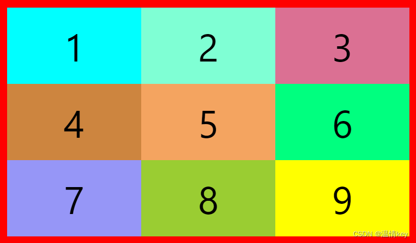
<style> * {
margin: 0; padding: 0; } .container {
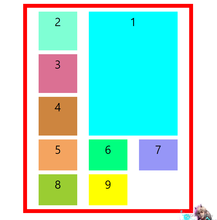
border: solid 10px skyblue; height: 400px; width: 400px; margin: 50px auto; font-size: 50px; line-height: 100px; text-align: center; /* Set the container layout to grid Layout */ display: grid; /* Specify the height of each line Each value is separated by a space */ grid-template-rows: 100px 100px 100px; /* Specify the width of each column Each value is separated by a space */ grid-template-columns: 100px 100px 100px; } .item1 {
background-color: aqua; } .item2 {
background-color: aquamarine; } .item3 {
background-color: palevioletred; } .item4 {
background-color: peru; } .item5 {
background-color: sandybrown; } .item6 {
background-color: springgreen; } .item7 {
background-color: turquoise; } .item8 {
background-color: yellowgreen; } .item9 {
background-color: yellow; } </style>

Grid Functions and keywords
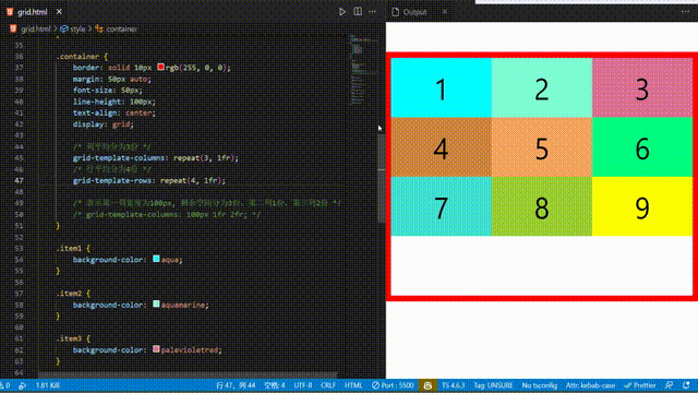
repeat function
You can simplify repeating values . This function takes two arguments , The first parameter is the number of repetitions , The second parameter is the value to repeat
grid-template-rows: 100px 100px 100px;
/*  Can be written as  */
grid-template-rows: repeat(3, 100px);
auto-fill keyword
Indicates auto fill , Let's go ( Or a column of ) To accommodate as many cells as possible in . Sometimes the cell size is fixed , But the size of the container is uncertain , Want to fill the container responsively , You can use it auto-fill Auto fill
.container {

    border: solid 10px rgb(255, 0, 0);
    margin: 50px auto;
    font-size: 50px;
    line-height: 100px;
    text-align: center;
    display: grid;
    /*  Indicates that the column width is  200 px, But the number of columns is not fixed , As long as the browser can hold , You can put elements  */
    grid-template-columns: repeat(auto-fill, 200px);
    grid-template-rows: 200px 200px;
}

fr keyword
In order to express the proportional relationship conveniently , Grid layout provides fr keyword (fraction abbreviation , Meaning for " fragment ”), It can be understood as the number of copies , Divide the remaining space into several parts
.container {

    border: solid 10px rgb(255, 0, 0);
    margin: 50px auto;
    font-size: 50px;
    line-height: 100px;
    text-align: center;
    display: grid;

    /*  The average score of the column is 3 Share  */
    grid-template-columns: repeat(3, 1fr);
    /*  The average score of the row is 4 Share  */
    grid-template-rows: repeat(4, 1fr);
}
/*  Indicates that the width of the first column is 100px,  The remaining space is divided into 3 Share , Second column 1 Share , The third column 2 Share  */
grid-template-columns: 100px 1fr 2fr;
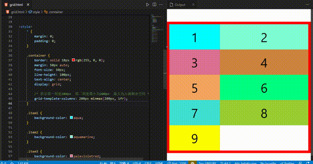
minmax function
minmax Function passes in a length range , The length is in this range , It takes two arguments , They are the minimum and the maximum
.container {

    border: solid 10px rgb(255, 0, 0);
    margin: 50px auto;
    font-size: 50px;
    line-height: 100px;
    text-align: center;
    display: grid;

    /*  Indicates the width of the first column 200px  The minimum width of the second column is 200px  The maximum is to occupy the remaining space  */
    grid-template-columns: 200px minmax(200px, 1fr);
}
auto keyword
auto keyword It means that the browser decides the size
.container {

    /*  Indicates that the middle column is automatically adjusted by the browser  */
    grid-template-columns: 200px auto 200px;
}

row(column)-gap gap
row-gap
Set each item( project ) Line spacing between ; row-gap: 10px Represent each item The line spacing is 10px
column-gap
Set each item( project ) Column spacing between ; column-gap: 20px Represent each item Column spacing is 20px
gap
Short form of the above two attributes ; gap: 10px 20px Represent each item The line spacing is 10px, Column spacing is 20px
.container {

    border: solid 10px rgb(255, 0, 0);
    margin: 50px auto;
    font-size: 50px;
    line-height: 100px;
    text-align: center;

    display: grid;
    grid-template-columns: repeat(3, 1fr);
    grid-template-rows: repeat(3. 1fr);
    /*  Row spacing 10px */
    row-gap: 10px;
    /*  Column spacing 20px */
    column-gap: 20px;
}
.container {

    /*  Row spacing 10px */
    row-gap: 10px;
    /*  Column spacing 20px */
    column-gap: 20px;

    /*  Equate to  */
    gap: 10px 20px;
}

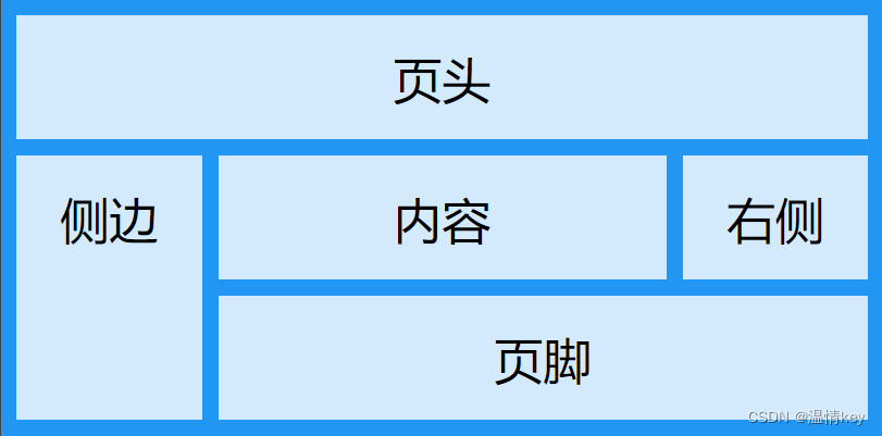
grid-template-areas
grid-template-areas Used to define the area , A range consists of one or more cells
This attribute is similar to the item attribute grid-area Use it together , Here we introduce .
grid-area Used to specify the area where the project is placed
<!DOCTYPE html>
<html lang="en">

<head>
    <meta charset="UTF-8">
    <meta http-equiv="X-UA-Compatible" content="IE=edge">
    <meta name="viewport" content="width=device-width, initial-scale=1.0">
    <title>area</title>
    <style> * {
       margin: 0; padding: 0; } .item-h {
       grid-area: header; } .item-s {
       grid-area: sidebar; } .item-c {
       grid-area: content; } .item-r {
       grid-area: right; } .item-f {
       grid-area: footer; } .container {
       display: grid; background-color: #2196F3; padding: 10px; gap: 10px; grid-template-areas: "header header header header header header" "sidebar content content content content right" "sidebar content content content content right" "sidebar footer footer footer footer footer"; } .container>div {
       background-color: rgba(255, 255, 255, 0.8); text-align: center; padding: 20px 0; font-size: 30px; } </style>
</head>

<body>
    <!--  Containers  container -->
    <div class="container">
        <!--  project  item -->
        <div class="item-h"> Header </div>
        <div class="item-s"> The side </div>
        <div class="item-c"> Content </div>
        <div class="item-r"> On the right side </div>
        <div class="item-f"> The footer </div>
    </div>
</body>

</html>
You can use decimal point (.) Indicates that this block does not need to be used

grid-auto-flow
grid-auto-flow Specify how the elements that are automatically laid out in the grid are arranged . The default placement order is " First, then ", Fill in the first line first , Start putting in the second line .
grid-auto-flow: row - First, then ( The default value is )
.container {

    border: solid 10px rgb(255, 0, 0);
    margin: 50px auto;
    font-size: 50px;
    line-height: 100px;
    text-align: center;

    display: grid;
    grid-template-columns: repeat(3, 1fr);
    grid-template-rows: repeat(3, 1fr);
    grid-auto-flow: row;
}
grid-auto-flow: column - List before you go
grid-auto-flow: column;

grid-auto-flow: row dense - Indicates that the space left during line feed can be filled by the following elements
.container {

    border: solid 10px rgb(255, 0, 0);
    width: 500px;
    margin: 50px auto;
    font-size: 50px;
    line-height: 100px;
    text-align: center;

    display: grid;
    grid-template-columns: 1fr 1fr 1fr 1fr;
    grid-template-rows: 1fr 1fr;
    gap: 10px;
    grid-auto-flow: row;
}

.item2 {

    background-color: aquamarine;
    /* column span 2 Indicates column span 2 A cell  */
    grid-column: span 2;
    /* row span 2 Indicates row span 2 A cell  */
    grid-row: span 2;
}

.item4 {

    background-color: peru;
    grid-column: span 2;
}

It's time to take advantage of dense To fill the blank space
grid-auto-flow: row dense;

justify(align)-items place-items
justify-items Set the horizontal alignment of the cell contents
align-items Set the vertical alignment of cell contents
justify-items: start | end | center | stretch( The default value is , Fill the whole cell );
align-items: start | end | center | stretch( The default value is , Fill the whole cell );
.container {

    border: solid 10px rgb(255, 0, 0);
    width: 400px;
    height: 400px;
    margin: 50px auto;
    font-size: 50px;
    line-height: 100px;
    text-align: center;

    display: grid;
    gap: 10px;
    grid-template-columns: repeat(3, 100px);
    grid-template-rows: repeat(3, 100px);
    justify-items: start;
}

justify-items: end;

align-items Empathy ,place-items It is the abbreviation of these two attributes
place-items: start end - First, then
justify(align)-content place-content
justify-content Set the horizontal position of the entire content area inside the container
align-content Set the horizontal position of the entire content area inside the container
place-content Abbreviations of the first two attributes
justify-content: start | end | center | stretch | space-around | space-between | space-evenly;   // horizontal direction
align-content: start | end | center | stretch | space-around | space-between | space-evenly;     //  vertical direction
start Align the start border of the container
end Align the end border of the container
center Center the inside of the container
stretch When the project size is not specified , Stretching takes up the entire mesh container ( Default )
space-around - The spacing between each item is equal . therefore , The gap between items is twice as large as the gap between items and container borders
space-between - The interval between the project and the project is equal , There is no gap between the item and the container border
space-evenly The interval between the project and the project is equal , The distance between the item and the container border is the same
justify-contentEquate to flex In the layoutjustify-contentalign-contentEquate to flex In the layoutalign-item
So I won't do more cases , Have a look flex There are no values for these two attributes in , space-evenly
.container {

    border: solid 10px rgb(255, 0, 0);
    width: 400px;
    height: 400px;
    margin: 50px auto;
    font-size: 50px;
    line-height: 100px;
    text-align: center;

    display: grid;
    gap: 10px;
    grid-template-columns: repeat(3, 100px);
    grid-template-rows: repeat(3, 100px);
    justify-content: space-evenly;
    align-content: space-evenly;
    /*  The above two lines are equivalent to  */
    /* place-content: space-evenly; */
}

grid-auto-columns(rows)
grid-auto-columns Used to set the column width of extra items grid-auto-rows Used to set the row height of extra items
For example, set up a 3X3 The grid of , But there is 10 A project , So there will be one more , At this time, you can use this attribute to set the extra item .
.container {

    border: solid 10px rgb(255, 0, 0);
    width: 400px;
    height: 400px;
    margin: 50px auto;
    font-size: 30px;
    line-height: 50px;
    text-align: center;

    display: grid;
    gap: 10px;
    grid-template-columns: repeat(3, 100px);
    grid-template-rows: repeat(3, 100px);
    grid-auto-rows: 60px;
}

Item attribute
grid-column-startgrid-column-endgrid-column(1 and 2 Short form of )grid-row-startgrid-row-endgrid-row(4 and 5 Short form of )grid-areajustify-selfalign-selfplace-self(8 and 9 Short form of )
grid-column(row)-start(end) / grid-column(row)
You can specify the four borders of the grid project , Which grid line to locate respectively , To specify the location of the project
grid-column-start The vertical grid line where the left border of the item is located grid-column-end The vertical grid line where the right border of the item is located grid-column: start / end The above two attributes are abbreviated
grid-row-start The vertical grid line where the top border of the item is located grid-row-end The vertical grid line where the lower border of the item is located grid-row: start / end The above two attributes are abbreviated
start Represents which grid line to start from , end Indicates which grid line ends
Value used span Represents occupying several cells
.container {

    border: solid 10px rgb(255, 0, 0);
    width: 400px;
    height: 500px;
    margin: 50px auto;
    font-size: 30px;
    line-height: 50px;
    text-align: center;
    padding: 10px;

    display: grid;
    gap: 10px;
    grid-template-columns: repeat(3, 100px);
    grid-template-rows: repeat(3, 100px);
    justify-content: space-evenly;
}

.item1 {

    background-color: aqua;
    grid-column-start: 1;
    grid-column-end: 3;
}

.item2 {

    background-color: aquamarine;
    grid-column-start: 3;
    grid-column-end: 4;
    grid-row-start: 1;
    grid-row-end: span 3;
}

.item3 {

    background-color: palevioletred;
    grid-column: 1 / 3;
    grid-row: 2 / 4;
}

grid-area
grid-area Specify the area where the project will be placed
.container {

    border: solid 10px rgb(255, 0, 0);
    width: 400px;
    height: 400px;
    margin: 50px auto;
    font-size: 30px;
    line-height: 50px;
    text-align: center;
    padding: 10px;

    display: grid;
    gap: 10px;
    grid-template-columns: repeat(3, 100px);
    grid-template-rows: repeat(3, 100px);
    grid-template-areas: "a a a" "b b b" "c c c";
    justify-content: space-evenly;
}

.item1 {

    background-color: aqua;
    grid-area: b;
}

grid-area It can also be used as grid-row-start / grid-column-start / grid-row-end / grid-column-end Abbreviated form
.container {

    border: solid 10px rgb(255, 0, 0);
    width: 400px;
    height: 500px;
    margin: 50px auto;
    font-size: 30px;
    line-height: 50px;
    text-align: center;
    padding: 10px;
    display: grid;
    gap: 10px;
    grid-template-columns: repeat(3, 100px);
    grid-template-rows: repeat(3, 100px);
    justify-content: space-evenly;
}

.item1 {

    background-color: aqua;
    /*  Represents the beginning of the first line   The fourth line ends   And   Start of the second column   The fourth column ends  */
    grid-area: 1 / 2 / 4 / 4
}
justify(align)-self / place-self
justify-self Set the horizontal position of cell content , Follow justify-items The usage of , But only for a single project
align-self Set the vertical position of cell content , Follow align-items The usage of , It only works on a single project
place-self Is the abbreviation of the above two attributes
.container {

    border: solid 10px rgb(255, 0, 0);
    width: 500px;
    height: 400px;
    margin: 50px auto;
    font-size: 30px;
    line-height: 50px;
    text-align: center;
    padding: 10px;

    display: grid;
    gap: 10px;
    grid-template-columns: repeat(3, 100px);
    grid-template-rows: repeat(3, 100px);
    justify-content: space-evenly;
}

.item1 {

    background-color: aqua;
    width: 60%;
    height: 60%;
    justify-self: end;
    align-self: center;
}

.item5 {

    background-color: sandybrown;
    width: 60%;
    height: 60%;
    place-self: center;
}

边栏推荐
猜你喜欢

Win11 prompts what to do if this site is unsafe? Win11 prompt the solution of unsafe site

Code forces round # 807 (DIV. 2) a - - D

Tool use -editor MD editor

JMeter 21 day clock in day06

SAP PP co02 recoil one key modification

JMeter 21 day clock in day05
Win11如何解除网络限速?Win11解除网络限速的方法

Sword finger offer21- adjust the array order so that odd numbers precede even numbers - Double pointers

Talk about distributed locks

爱可可AI前沿推介(7.16)
随机推荐
Application of virtualization technology in enterprise network
Windbos common commands (learning records)
1.Torchvision
On network and information security technology in wireless network
分享不同,精彩纷呈 | 开发者说·DTalk 年中鉴赏
Win11提示此站点不安全怎么办?Win11提示站点不安全的解决方法
行为型模式总结
【工具使用篇】CLion Keymap
Several systems commonly used by servers
Typora绘图
airtest+poco多脚本、多设备批处理运行测试用例自动生成测试报告
Third week of sprint
swift中struct & class &闭包封装
【Day4】optimization
[multithreading] lock optimization mechanism in synchronized (biased lock - & gt; lightweight lock - & gt; heavyweight lock)
更改信号采样率和测量均值频率、功率、带宽
High order DS --- AVL tree
3.3. VGG_ model
SFF1602-MHCHXM超快恢复二极管SFF1602
Splunk 配置多集群 index