当前位置:网站首页>微信小程序的常用组件
微信小程序的常用组件
2022-07-17 05:10:00 【一指流沙q】
目录
一、常用的视图容器类组件
① view
- 普通视图区域
- 类似于 HTML 中的 div,是一个块级元素
- 常用来实现页面的布局效果

| 属性 | 说明 | |
| text-align | 用来设置元素中的的文本对齐方式.只对文本有效,对元素无效,不能设置元素的对齐方式; | |
| line-height | 行高,当line-height=height,文字居中 | |
| display:flex | 弹性盒:它决定一个盒子在其它盒子中的分布,以及如何处理可用的空间。使用该模型,可以轻松的创建"自适应"浏览器窗口的流动布局。 | |
| justify-content | 属性 | 说明 |
| flex-start | 排列在当前行的最左边 | |
| flex-end | 排列在当前行的最右边 | |
| center | 排列在当前行的中间位置 | |
| space-between | 间距相等排列,两边不留白 | |
| space-around | 间距相等排列,两边留白等于间距的一半 | |
first.wxml
<view class="container1">
  <view>A</view>
  <view>B</view>
  <view>C</view>
</view>
first.wxss
.container1 view {
  width: 100px;
  height: 100px;
  text-align: center;
  line-height: 100px;
}

.container1 view:nth-child(1) {
  background-color: lightgreen;
}

.container1 view:nth-child(2) {
  background-color: lightskyblue;
}

.container1 view:nth-child(3) {
  background-color: lightcoral;
}

.container1 {
  display: flex;
  justify-content: space-around;
}
② scroll-view
- 可滚动的视图区域
- 常用来实现滚动列表效果

second.wxml
<scroll-view class="container1" scroll-y>
  <view>A</view>
  <view>B</view>
  <view>C</view>
</scroll-view>
second.wxss
.container1 view {
  width: 100px;
  height: 100px;
  text-align: center;
  line-height: 100px;
}

.container1 view:nth-child(1) {
  background-color: lightgreen;
}

.container1 view:nth-child(2) {
  background-color: lightskyblue;
}

.container1 view:nth-child(3) {
  background-color: lightcoral;
}

.container1 {
  border: 1px solid red;
  height: 120px;
  width: 100px;
}
③ swiper 和 swiper-item
- 轮播图容器组件 和 轮播图 item 组件

属性 | 类型 | 默认值 | 说明 |
indicator-dots | boolean | false | 是否显示面板指示点 |
indicator-color | color | rgba(0, 0, 0, .3) | 指示点颜色 |
indicator-active-color | color | #000000 | 当前选中的指示点颜色 |
autoplay | boolean | false | 是否自动切换 |
interval | number | 5000 | 自动切换时间间隔 |
circular | boolean | false | 是否采用衔接滑动 |
third.wxml
<swiper class="swiper-container" indicator-dots>
  <swiper-item>
    <view class="item">A</view>
  </swiper-item>
  <swiper-item>
    <view class="item">B</view>
  </swiper-item>
  <swiper-item>
    <view class="item">C</view>
  </swiper-item>
</swiper>
third.wxss
.swiper-container {
  height: 150px;
}

.item {
  height: 100%;
  line-height: 150px;
  text-align: center;
}

swiper-item:nth-child(1) .item {
  background-color: lightgreen;
}

swiper-item:nth-child(2) .item {
  background-color: lightblue;
}

swiper-item:nth-child(3) .item {
  background-color: lightpink;
}
二、常用的基础内容组件
① text
- 文本组件
- 类似于 HTML 中的 span 标签,是一个行内元素
通过 text 组件的 selectable 属性,实现长按选中文本内容的效果:
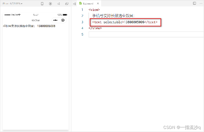
fouth.wxml
<view>
  手机支持长按选中效果
  <text selectable>13800005006</text>
</view>
② rich-text
- 富文本组件
- 支持把 HTML 字符串渲染为 WXML 结构
通过 rich-text 组件的 nodes 属性节点,把 HTML 字符串渲染为对应的 UI 结构:

fifth.wxml
<rich-text nodes="<h1 style='color: red;'>标题</h1>"></rich-text>三、其它常用组件
① button
- 按钮组件
- 功能比 HTML 中的 button 按钮丰富
- 通过 open-type 属性可以调用微信提供的各种功能(客服、转发、获取用户授权、获取用户信息等)

sixth.wxml
<button>默认的按钮</button>
<button type="primary">主色调按钮</button>
<button type="warn">警告按钮</button>

<button size="mini">默认的按钮</button>
<button type="primary" size="mini">主色调按钮</button>
<button type="warn" size="mini">警告按钮</button>

<button size="mini" plain>默认的按钮</button>
<button type="primary" size="mini" plain>主色调按钮</button>
<button type="warn" size="mini" plain>警告按钮</button>
② image
- 图片组件 image
- 组件默认宽度约 300px、高度约 240px

image 组件的 mode 属性用来指定图片的裁剪和缩放模式,常用的 mode 属性值如下:
mode 值 | 说明 |
scaleToFill | (默认值)缩放模式,不保持纵横比缩放图片,使图片的宽高完全拉伸至填满 image 元素 |
aspectFit | 缩放模式,保持纵横比缩放图片,使图片的长边能完全显示出来。也就是说, 可以完整地将图片显示出来。 |
aspectFill | 缩放模式,保持纵横比缩放图片,只保证图片的短边能完全显示出来。也就是说, 图片通常只在水平或垂直方向是完整的,另一个方向将会发生截取。 |
widthFix | 缩放模式,宽度不变,高度自动变化,保持原图宽高比不变 |
heightFix | 缩放模式,高度不变,宽度自动变化,保持原图宽高比不变 |
seventh.wxml
<image></image>
<image src="/images/1.jpg"></image>
seventh.wxss
image {
  border: 1px solid red;
}
③ navigator
- 页面导航组件
- 类似于 HTML 中的 a 链接

属性名 | 类型 | 默认值 | 说明 |
navigationBarTitleText | String | 字符串 | 导航栏标题文字内容 |
navigationBarBackgroundColor | HexColor | #000000 | 导航栏背景颜色,如 #000000 |
navigationBarTextStyle | String | white | 导航栏标题颜色,仅支持 black / white |
1.设置导航栏的标题
设置步骤:app.json -> window -> navigationBarTitleText 需求:把导航栏上的标题,从默认的 “WeChat”修改为“黑马程序员”,效果如图所示:

2. 设置导航栏的背景色
设置步骤:app.json -> window -> navigationBarBackgroundColor 需求:把导航栏标题的背景色,从默认的 #fff 修改为 #2b4b6b ,效果如图所示:

3.设置导航栏的标题颜色
设置步骤:app.json -> window -> navigationBarTextStyle 需求:把导航栏上的标题颜色,从默认的 black 修改为 white ,效果如图所示:

注意: navigationBarTextStyle 的可选值只有 black 和 white
微信小程序开发文档:view | 微信开放文档 (qq.com)
分享我创建的学习笔记网站:George's Notes (gitee.io)
边栏推荐
猜你喜欢

利用IDE打jar包

LiveData浅析

解决idea新建module 提示module xxxx does exitst

A comprehensive performance optimization, from 5 seconds to 1 second

Solutions for vscode terminal failure

Minor problems of GCC compiling C language in ubantu

1 sparksql overview

跨域和处理跨域

Questions d'entrevue courantes du système d'exploitation

1. Neusoft cross border e-commerce warehouse demand specification document
随机推荐
What is the employment prospect of software testing? There is a large demand for talents and strong job stability
C语言的指针函数
List与Map
Scala初级实践——统计手机耗费流量(1)
5.1 business data acquisition channel construction of data acquisition channel construction
[efficiency of function]
Rxjs源码解析(一)Observable
A comprehensive performance optimization, from 5 seconds to 1 second
Advanced operation of C language
【函数的效率】
12.数据仓库搭建之ADS层搭建
字符处理函数
Application of recursion
MySQL学习笔记(4)——(基本CRUD)操作数据库中的表的数据
Is the cookie valid for a limited time? How to set cookies? Teach you to set by hand
Ambari 2.7.5 integrated installation hue 4.6
Constants and constant pointers
3.东软跨境电商数仓项目架构设计
柠檬班软件测试培训可靠吗 这个从培训班逆袭成功的案例告诉你
[bug solution] org apache. ibatis. type. TypeException: The alias ‘xxxx‘ is already mapped to the value ‘xxx‘